Gaylen Gerber: Artist Lecture Series, Vienna Conversations
by Eva Badura-Triska
The following conversation between artist Gaylen Gerber and Vienna-based curator Eva Badura-Triska took place at Galerie Emanuel Layr in Fall 2016 as part of the Artist Lecture Series Vienna Conversations. The transcript below is a full record of the talk, on the occasion of Gerber’s solo exhibition, which presented a number of recent Supports.
November 9, 2016
Ezara Spangl: I would like to introduce this conversation. To begin, I want to thank Galerie Emanuel Layr for hosting the conversation. Tonight, on the occasion of Gaylen Gerber’s exhibition, Gaylen Gerber and Eva Badura-Triska will speak together. Eva Badura-Triska is a Vienna-based curator and expert on Viennese Actionism as well as on Viennese artists emerging in the 1980s; in her early career she also wrote on the Chicago Imagists. Gaylen Gerber is an artist; he has exhibited widely, including recent projects at Kunsthaus Bregenz; the Museum of Contemporary Art, Chicago; The Whitney Museum of American Art, New York; and The Art Institute of Chicago. Thank you, Gaylen and Eva, for speaking tonight.
Eva Badura-Triska: Thank you, Ezara and Rainer Spangl, for arranging this. Obviously, in preparing for this evening I read a number of articles on Gaylen’s work and reflected on it at length, in the process asking what might give continuity to our conversation. Because we are speaking in the context of the show at Emanuel Layr in Vienna, I thought that Gaylen’s relationship to this city and in particular the history of his exhibitions here might be a good guide for leading us through his work.
Gaylen, you told me yesterday that you were in Vienna quite often and you have often exhibited here. Having seen a number of these shows, I would like to start with the exhibition you had in 1989 at the Galerie nächst St. Stephan, which I remember quite well. In the gallery’s first room there was a wall with a row of five paintings, all of which were very vague. You could hardly distinguish anything. They were monochromatic but representational paintings. It was difficult to distinguish the image. I do not remember what was represented.
Gaylen Gerber: Yes, there were three rooms to the gallery and the first two had gray paintings. It is what I think of as my early work, gray paintings, a little bit less than a meter square, all done in very close values of the same gray, and there is a genre image represented. The way I have described it to people is that the experience of the paintings is a little like walking into a dark theater. Initially you see the undifferentiated monochrome, and then, as your eyes adjust to the painting, you are able to differentiate the image. But in the process you lose the unified field. A genre is more of a category of composition than a personal image. I wanted to emphasize the reception of the work and our changing perception in relationship to it, and in the process address memory, proximity, and conditions of display, among other issues that were central to understanding it, and so a genre was useful. The meaning of these works was as much between works as it was in a single artwork.
EB-T: Exactly. I thought it was about seeing, about making very fine distinctions. And I wonder if it was also about ambivalence?
GG: Yes. Maybe even artistic indifference.
EB-T: Because I think ambivalence is about seeing things in a way that conveys mixed feelings or contradictory ideas, or having trouble seeing things because of uncertainty or fluctuation, it is of importance in your work and we should come back to it. Galerie nächst St. Stephan as you know, is a special place. Rosemarie Schwarzwälder always followed a precise concept. And particularly in those days, in the 1980s and 1990s, it was a very specific gallery. Its program was quite influenced by an interest in positions that aimed at evoking feelings of the sublime, and certainly abstraction and the monochrome were great issues, as was an analytic approach to painting. When I talked to you yesterday, you said you were invited because they considered you a painter.
GG: Yes, they assumed that I was an abstract artist. Rosemarie Schwarzwälder was always incredibly gracious towards me and I enjoyed working with her, but it was kind of a mistake, and it took a while to become clear that I didn’t fit into the scheme of the gallery.
EB-T: I know it is a delicate issue, but in those days you framed your work more conventionally as painting. Your work referred to the work of artists like Ad Reinhardt, who was engaged with subtle distinctions or contrasts between elements. Was that an issue you were interested in?
GG: Yes, I would actually say the genesis of my early practice may be attributed primarily to Ad Reinhardt, Andy Warhol, and then, later, to Robert Venturi and Denise Scott Brown. In each case, the work articulates an expression and a relationship between a normative ground and an iconic image. Reinhardt’s work taught me how to define an artwork in the negative. I think that may have been a large part of the confusion with Galerie nächst St. Stephan—they understood the relationship of my work to the history of painting, but I was moving it in a direction that they had not considered.
EB-T: Obviously you did. But still, it is interesting that you say you were interested in and informed by Reinhardt and Warhol. Normally, one would see their work as quite opposed, but then I believe that reconciling opposites is something that goes through your work.
GG: Reinhardt’s and Warhol’s work is actually very similar.
EB-T: Can you explain that?
GG: I would say that both artists posit a relationship between the image and the ground in a way in which the two elements are dependent on and also decidedly distinct from one another. They chose very different terms but the work of both has similar spiritual and ecclesiastical connotations and references. I learned from Reinhardt’s work that what art is not is also an affirmation of what it is. His work resolved in a prime sense the dichotomy that exists between a unified field represented by the monochrome and an iconic image represented by the cruciform. His work also made apparent the importance of structuring the experience phenomenally. Much the same is true for Warhol’s work, and he demonstrated a similar detachment. In his early work especially, the monochromatic ground and the iconic image are recognizably separate. Taking a cue from Byzantine icons and the iconostasis, Warhol substituted profane representation from popular visual culture for traditional representation, but the structure intended to facilitate communication with the sacred remained. Both artists’ work addresses a sense of the infinite. This was clarified for me later by the work of Robert Venturi and Denise Scott Brown, who—building on various vernacular models—made it apparent that the ground and the figure or sign could be separated completely.
EB-T: Absolutely. This is what I associate with Reinhardt. I also read Warhol’s electric chairs as an image that is a meditation on death. The figure-ground is, of course, a painterly issue, but at the same time…
GG: It is a philosophical issue.
EB-T: That is what I want to say. Because the ground in German is the Grund, which also means the reason. I think they don’t have the same thing in the English language?
Would you elaborate on your relationship to Robert Venturi and Denise Scott Brown’s work? They are architects and theorists and considered seminal figures in the so-called postmodern dictum, which is broadly understood as the movement that developed across the arts, philosophy, and criticism and marked a departure from modernism. It is typically defined by an attitude of irony and skepticism towards various ideological tenets. They certainly do not seem in line with the intentions of monochrome painting or Ad Reinhardt?
GG: I consider Robert Venturi and Denise Scott Brown’s work to be a continuation of modernism and not a break with it. I also do not see a fundamental contradiction between Reinhardt’s and Venturi and Scott Brown’s practices except maybe in the mode and rate of reception. Venturi and Scott Brown’s work popularized ideas that posited a new form of architectural representation that reflected the influence of car culture, among other things. Those ideas later spread through the larger field of representation, but their work was closer to a confirmation of my thinking than inspiration. I feel their primary contribution was that they made it apparent that the sign and the ground could be aggressively separated. Their practice reflected that separation, and an interest in the accelerated rate at which the architectural sign could be understood. My work took a different course by eventually inverting the sign and the ground, and slowing the rate of reception to something closer to that of Reinhardt’s work, which requires time to understand what is being seen.
EB-T: I would like to continue our chronology, this time with a personal aside which brings us to Chicago, where you live. I was there in 1990 and I had a studio visit with Joe Scanlan, who is a friend of yours. You know each other and have worked together, and Joe in these days was working for the Renaissance Society, where, in 1992, you had an important exhibition. To me it seems that here the issues in your work had changed. The exhibition was more about the space and the ambivalence of the space, or the cutting up and rearranging of it.
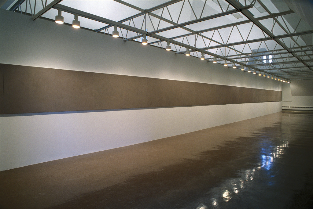
GG: My understanding of the work had not changed—the exhibition demanded another solution. Initially Susanne Ghez, who was then the director of The Renaissance Society, proposed a survey of my early gray paintings. Before this exhibition these paintings had been exhibited almost exclusively in broken rows with equal spacing between them. Susanne proposed installing them in this way in a series of rooms, with the paintings organized chronologically. All of the early gray genre paintings are untitled, not dated, and are actually not signed. So not only was it impossible to orchestrate them chronologically, but I also did not like the idea of reinforcing that and the other hierarchies implied in this proposal. I was looking for another solution, a way to level the presentation and retain my intentions. In the end, we exhibited twenty-five paintings installed in a row, and contiguous, on a temporary wall that spanned and truncated the width of the gallery and created a single space, denying access to the majority of the museum and creating a promenade. It is a scheme that foreshadowed much of my subsequent work, in which I position a monochromatic surface itself as the contextual ground or support for the art and activities represented by it.
EB-T: I have seen images of this installation. Were the paintings from the same body of work that was exhibited at Galerie nächst St. Stephan?
GG: Yes.
EB-T: I see. They were different images.
GG: No, they were all the same image.
EB-T: The same image, but…
GG: Well, they are unique paintings.
EB-T: Are they repetitive the same way as you have in Warhol?
GG: Closer to artists like On Kawara and Roman Opałka.
EB-T: I see. Well, there are subtle distinctions. It is really about subtle distinctions in the works.
GG: My work and practice have always utilized repetition and attention. I considered these artworks to be performative objects that often require an acute attentiveness. This is something that I’ve explored in depth in the work, but describing a performative object’s relationship to reception in other than practical terms is complicated. Among other things, the experience needs to engage and foster a willingness in the viewer to see past the limitations of the medium, to entertain the larger premise put forward by the work. It involves the manipulation of space and movement. The result is a contraction and extension of perception that is intended to be notable, but that is just a part of it.
EB-T: Let’s come back to Vienna now. In 1994, you had another show at Galerie nächst St. Stephan, with Angela Grauerholz and James Welling, where you provided a background?
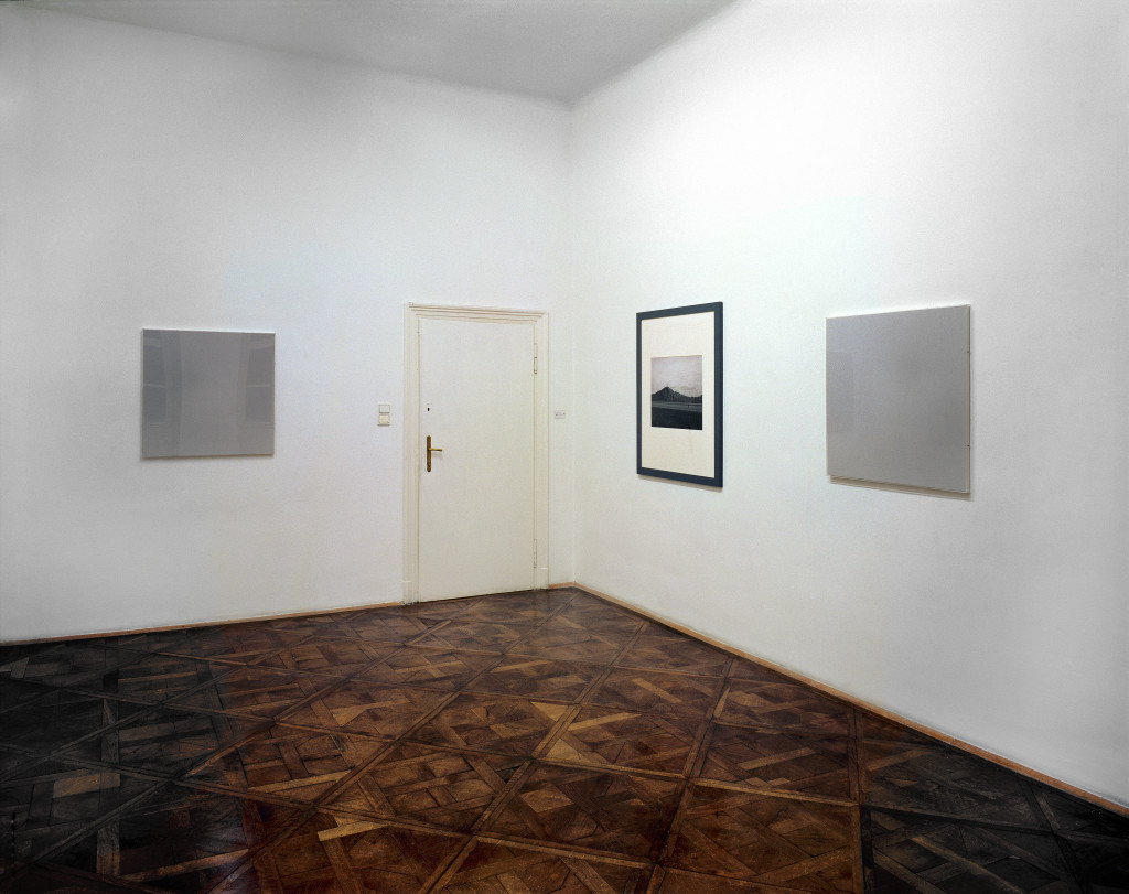
GG: The work that I exhibited in that show was part of a group of early photographic artworks. They were silver prints of a clear sky on a bright day. We took a large format camera to the roof, pointed it straight up, and made a number of exposures. When the images were printed they looked like exposed photographic paper without an image—until you realized they are photographs of a clear sky, which is also an image of the infinite. At Galerie nächst St. Stephan, I presented a room of these photographs, each in a highly reflective Plexiglas frame along with one of Jim Welling’s early gelatin silver prints of a Wyoming landscape. My intention was to have my representation connect with the almost identical representation of the sky in his photograph, and together I hoped that they might cut the foreground landscape in his image loose, separating it from the unified ground of the skies. It did just that, but the thing that I had not anticipated was that the Wyoming landscape made my images immediately recognizable as representations too. The relationships I was trying to frame were there, but the exchange between representations and artists was more complex than I had anticipated.
EB-T: Had you painted the wall gray or not?
GG: No.
EB-T: So the work was just on the gallery’s white wall?
GG: Yes.
EB-T: Who had made the choice of artists—was it you or was it the gallery?
GG: It was likely Rosemarie Schwarzwälder.
EB-T: So it was really still a group show where you were involved but it was not an installation by you? Not yet an exhibition where you provided a Backdrop for works by other artists?
GG: It was organized as a three-person exhibition, but at this point I was already formulating my practice as an ensemble. The room I’m describing was an installation in which I intentionally brought Jim’s [James Welling’s] photograph into my work with my work functioning as the ground to his expression.
EB-T: So this makes two exhibitions with Galerie nächst St. Stephan. You were represented by the gallery but you were not quite an artist of this gallery. At some point, you must have met Heimo Zobernig, with whom you’ve worked for a number of years? Heimo is an artist who plays an important role in my life as an art historian.
GG: I had met him earlier, but I cannot remember whether we met here in Vienna for the first time or whether it was in Chicago.
EB-T: In 1990, I was in Chicago for this famous documenta panel at the art fair Art Chicago. It was a discussion with Jan Hoet, Denys Zacharopoulos, Helmut Draxler, and myself, I was so nervous. Heimo was with us, he made the booth of Peter Pakesch at Art Chicago. At the same time, Franz West‘s work was in Chicago as part of an exhibition at The Renaissance Society.
GG: That is interesting, I remember seeing Peter’s booth. Heimo and I must have met here in Vienna, then, because that was after I began visiting and exhibiting here.
EB-T: And when did you start to collaborate?
GG: That came much later. At this point we were friends and we were working with the same gallery in Chicago, Robbin Lockett, which unfortunately no longer exists. We did not actually work together until 2003.
EB-T: Okay, to continue with your Vienna shows, the next one was last year, at Galerie Emanuel Layr.
GG: No, there was one or two in between.
EB-T: Which ones?
GG: At Galerie Michael Hall, with Helen Mirra in 2002, and then at PRO-CHOICE, in 2011.
EB-T: Sorry, apparently I missed these. Can you say a little more?
GG: The exhibition at Galerie Michael Hall had two pieces. A paper Backdrop of mine occupied the rear of the gallery, and Helen Mirra’s 48º N comprised of a number of components—an early cotton banding work with an audio installation including a monitor and shelf—ran across it and occupied the room.
PRO-CHOICE was an exhibition space organized by the artists Will Benedict and Lucie Stahl on Zedlitzgasse, just around the corner from here. Will had come to see me in Chicago, and we worked together on his exhibition for Neue Alte Brücke in Frankfurt in 2010. Then I did an exhibition for them here in Vienna in 2011. At that point, I had been addressing a range of expressions using a limited, normative palette, but I had run into a kind of pictorial eddy. I was painting over other artworks, mostly paintings, and the problem I was having was that when you paint over another painting, you often end up with a rectangular monochrome with a limited referent, which unfortunately did not articulate my intentions as well as it might have. One solution was to displace the original colors of the painting that had been painted over with gray or white onto the walls of the gallery—in essence you ended up with a white or gray monochromatic painting and a very colorful contextual ground.
EB-T: And this was in Vienna?
GG: No, but it led to a similar kind of exhibition in Vienna. I had been working with Daniel Buren as part of the survey of my work at Mudam Luxembourg in 2006. He was in Chicago for an exhibition at The Arts Club of Chicago, and so we had the opportunity to see each other. After his exhibition closed in Chicago, I asked for and received a number of souvenirs, or remnants, from his work in situ. All of them were Plexiglas panels—some with his trademark motif of alternating bands and some simply transparent, monochromatic color. I had a number of the souvenirs silver-leafed to heighten their phenomenal presence. Then, as a way to skirt and confront the idea of permeability in an artist’s work and practice, and also to visualize the limits of our ability to discern objects, symbols, circulation, etc. from the visual field, I aggressively displaced the color of the souvenirs into the room.
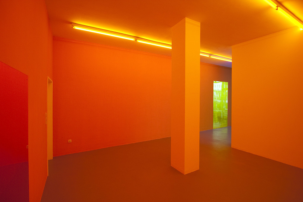
For the exhibition at PRO-CHOICE, I installed the panels now titled Support on walls painted in similar and contrasting hues and bathed in tinted light—suffusing color with color to the extent that our eyes often drown in its saturation. As far as our cognitive faculties were concerned, it was uncertain whether the differences perceived were contained within the image, the frame, or the exhibition space. It almost seemed that everything, including the whole of the exhibition context that would normally be perceived as the background for expression, remained in the foreground of our perception and understanding. So the exhibition had a very different sense of ambiguity about it—and that was the show with Will and Lucie.
EB-T: So “ambiguity” is the word you used and highly saturated hues were involved. Very interesting. It looks like you are going from a kind of minimum to a maximum.
GG: I had not thought of it that way, but I understand why you would say that. When I did a similar exhibition in Essen in 2010, I ran into a gallerist from Düsseldorf who took me to task for not giving him enough for twenty years. He now accused me of giving him too much. If you look at my practice, I have really tried to be with the world, but it seems that I am most often either behind or ahead of it. I have a hard time being with it. This is one example of a phenomenal situation that is not easily shared with another person. It is possible to see it with others, but it is specific to an individual’s body.
EB-T: That is really interesting, because now I would like to introduce something that I had not intended to talk about, but I am just preparing a show on Op art and I want to focus on the physical experience these works incite. Op art is about visual phenomena, but it is also something that involves the whole body. Many of the artists involved object to the term “Op art” because they say all art is optical or about optical phenomena and about looking. Talking about your work, it seems that like in Op art there is also extreme overexposure and underexposure. I have seen images of the show at the Kunstverein Ruhr in Essen, where there is overexposure—the saturated room that makes a viewer feel uneasy and unsure of what they are seeing, uncertain of the boundaries that articulate things, ambivalent.
GG: I would like to say one more thing. I also intended the highly chromatic exhibitions to be pleasurable experience. People often assume that I am an ascetic because my work initially seems bare, but I do not think of it that way. So for me this kind of situation was not such a big shift in action or strategy.
EB-T: I think it is marvelous you say all these things, because when one reads texts about your work everybody says it is about context—conceptual art. So now, in your words, it is also about pleasure and visibility. I love that, thank you very much for saying such things!
Let’s continue with the exhibition you did here in Vienna with Galerie Emanuel Layr in 2015, where you created a background. It was the first time I experienced one of your Backdrops in person. And this Backdrop, was it paper?
GG: It was gray background paper with an accordion fold, much like the way older roadmaps were practically folded and arranged.
EB-T: So you made backgrounds that are very physical. Are the folds necessary?
GG: I chose to have them, so I would think so. The pleats are folded to the general proportions of a torso and the work is scaled to an individual body even while the entirety of a Backdrop helps the exhibition take on the form of a single installation. Because the Backdrops most often occupy the rear walls of an exhibition situation, each literally and figuratively acts as the support for the other artworks and activities that are presented with it, to underscore the network of exchanges between elements. These pieces also originally came about because as the work grew larger it also became more expensive to produce. The paper Backdrops were an economical alternative. A paper Backdrop could be folded into a relatively small box and FedExed almost anywhere in the world for a relatively reasonable amount of money. Once there, it could be unfolded and cut to fit that particular exhibition situation.
EB-T: Because your Backdrops become part of the background, they play with invisibility. Viewers are not always aware that there is a work by you in the room, because it reads as a wall in the background and not as an artwork. But with the folds in the paper Backdrops you underscore your presence.
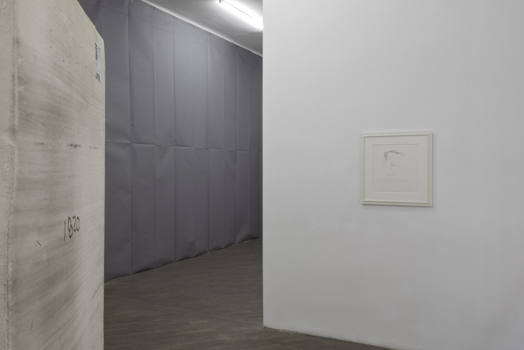
GG: I think that is probably true, but you would be surprised. Once you install another artwork with the Backdrop, it is difficult not to read it as background. In the exhibition at Galerie Emanuel Layr with Park McArthur and Jim Nutt, we had intended to install an artwork by Nutt directly on top of my Backdrop. But once it was installed, it was apparent that it was not advantageous to Jim’s work. So we arrived at a solution that was more beneficial to seeing his work, and as a result my work became more recognizable and discrete in this situation than I had initially intended.
EB-T: I think it is because of Jim Nutt’s work in this exhibition that Emanuel brought us together for this talk tonight. I was introduced tonight as somebody who has written about the Chicago Imagists. This was only a short text, and singling it out as important is really an overstatement, but there is a remarkable group of works by these artists in mumok’s collection. In the 1970s, Alfred Schmeller, then director of the Vienna Museum des 20. Jahrhunderts—the precursor of mumok—felt quite sympathetic to this work and he was in contact with them and in particular with their gallerist Phyllis Kind. I guess his interest developed because the work of the Imagists is similar in some ways to that of a group of artists in Vienna whom he patronized called Wirklichkeiten (“Realities” in English), which is also a very special kind of idiosyncratic “bad painting.” When I was a young curator at mumok, I was not especially interested in this kind of work—something that has changed in the meantime. There were, however, so many paintings by the Imagists in the museum’s collection that, when we worked on a major catalogue of the museum’s holdings, we had to address these artists. I was asked to write about them. I am far from being an expert on this movement, but I am familiar with it, including Jim Nutt.
Let me ask a question that interests me in particular and seems at the core of your work: how do you choose the artists you work with? Why, for example, Jim Nutt? And why bring his work together with Park McArthur’s?
GG: I thought it would make an interesting exhibition that might be beneficial to everyone involved, myself included. Park McArthur and Jim Nutt are both great artists and they are both dealing with the body in very particular terms. It was an exhibition that was intended to have each artist’s work represent a lucid and independent understanding of the realist tradition within a single, unified situation. And I think it did that.
EB-T: I want to delve a little deeper into this, because you are bringing together artists who are very different. They represent a variety of artistic approaches. Is this something you want to show? Is this an issue for you, bringing together this variety of individuals?
GG: I am interested in difference, the way in which people and things are not the same and in the range of differences. Culture tends to favor homogeneity, but that is in part an inability to tolerate a degree of difference as well as a practical solution. Because of the nature of representation, and perhaps personal inclination, I often approach difference paradoxically. So, yes, I am interested in using a range of expressions. It allows me to approach ideas that are often difficult to address in another way. In practical terms, because I’m using a normative ground, my work benefits from embracing differences, which together tend to amount to something larger than the sum of their parts.
EB-T: This touches on philosophy, so let’s go into that a little bit, or rather, into artists’ ideology. In the 60s, artists of related thinking and intention, still stuck together, but now the conversation has opened up. Franz West, an artist I knew very well, also brought many artists together—all sorts of different positions on one wall. And he often said to me, “I am interested because they are all so different, I put them together because everybody has his or her own expression.” So I wonder if this is also the issue that interests you? Providing a kind of foil for this multiplicity, for this difference?
GG: I feel that my work is close to Franz’s statement in character, but I am not interested in being “a foil,” in preventing something from being examined. I often include something because I want to see and to understand it as clearly as possible.
EB-T: There is also your use of the term “collaboration.”
GG: I use the word “cooperation.”
EB-T: Cooperation. Okay, yes. I was wondering if you would also accept the term “conversation” between these works?
GG: Between my work and other people’s work?
EB-T: I had an interesting conversation with a colleague recently who was talking about art hangings in the eighteenth century. It had to do with bringing different things together and not trying to make something inconsistent seem logical. She referred to a cartoon from the eighteenth century that suggested the works would even converse amongst themselves. It was a bit of a joke then, but when you or when Franz West have deliberately arranged a “meeting” of diverse works, I wonder if a conversation between them happens. Of course, not literally, but a viewer may create or experience a kind of conversation between them. Also in the sense that the artist was conversing with these various positions in making the work. Is this an issue that interests you? Are there unexpected interconnections?
GG: Sometimes there is an opportunity or situation that benefits from what you’re describing. I will give you an example. I did an exhibition at Mudam Luxembourg in 2006 in which I included Rémy Zaugg’s work. The paintings were from a suite of text paintings he had made close to the end of his life that were meditations on death and art. They were worded in French and mused on the way things disappear at the moment of their perception. I installed Rémy’s work in concert with other artworks that sometimes looked foolish, or humorous, or ambivalent, or even ignorant, but they were poignant in ways that were consistent with what I consider his expression to be and with the conversation that the work engendered.
EB-T: So this was a very deliberate decision.
GG: Yes.
EB-T: But then you wanted to break the kind of…pathos…
GG: Well, not necessarily. I thought it was something that Rémy would likely never have done himself and I thought it was an aspect of his work that should be addressed.
EB-T: So, when you are bringing artists together, or rather, making arrangements of various works, how does this process begin? Do you think of an artist and then you start writing letters? Or do gallerists propose ideas?
GG: It is a little bit different every time. Usually I have seen an artist’s work somewhere and one day it occurs to me that I should make an exhibition with them. Usually you can call artists and they are generally willing—if you have considered the work—to entertain your idea.
EB-T: I read somewhere that you are a great networker.
GG: Oh, that is a misnomer. I am a little agoraphobic. I tend to perceive the world to be unsafe with no easy way to get away.
EB-T: Okay…
GG: The work needed difference, I chose to delegate it outside of myself. The work is extrinsic in that way—its expression is partly mine, its essential character comes from the world. The objects and expressions have a range of existing meanings and associations and I have tried to treat them with parity in my practice. When I refer to difference, it is with a recognition of the broad range of expressions whose value may not easily correspond with mainstream Western norms.
EB-T: There is something else that interests me in your work. I want to understand how you pick up on and develop something?
GG: I often notice or recognize something that I might use in the work and give it a platform in order to understand it better. I will give you an example. When I first saw Park McArthur’s work I was taken with its emotional quality. It was succinct and she is a great editor of her own work. She was one of the first artists I have seen since, maybe, Eva Hesse to address the body with such gravity, fragility, humor, and even hubris. She did it in a way that really seemed to have few peers with the exception of, I would say, Cameron Rowland, who turned out to be a friend of hers. I was interested enough that I went to the gallery during her first exhibition to purchase one of her ramps. I thought I should live with one and see if I was correct in my assessment, if it would hold up to repeated exposure. It turned out that all the pieces had been sold. They were placed as a group—staying together—so I could not be angry. A few months later, I was in Miami for the art fair and I saw two of her Polyurethane Foam pieces that had recently been produced. I was walking through the fair during its installation and I was so taken with these pieces that I walked right past her gallerist, Maxwell Graham, who then came up to say hello. All I could say was, “Whose work is this?” When Maxwell said it was Park’s, I immediately knew I should work with her. The works are exceptional, but I did not have ideas about an exhibition or how to properly address them. But her work occupied a larger place in my thinking after that. A few weeks later, Emanuel contacted me about the possibility of doing an exhibition in June. As we started talking, it became clear that we might build an exhibition including Park’s work. Almost as quickly I knew that Jim Nutt’s work should be included too. I had included Jim’s work in an exhibition at the Museum of Contemporary Art in Chicago a few years before, and I had known his work for decades before that. I contributed a gray paper Backdrop to the exhibition that wrapped the back of the gallery. My work had a physical presence that related to both Park’s and Jim’s work and referenced the body in a way that was also very different. So in this instance I did not start with the paper Backdrop, I ended with it.
EB-T: You are establishing a relationship between these artists.
GG: I leave that to the viewer, but I would think that there is an interesting relationship there.
EB-T: Everyone confronted with a constellation like this would find a way to address it, and I would think that this is something your work is about.
One more point, your Backdrops have such a physical presence, I do wonder about the role the body plays in your work. Did you ever have something performative happen in relation to your Backdrops?
GG: Well, I think it is all performative. And these artworks are, by their very character, performative objects, which is why they are titled Backdrop or Support. But you are referring to explicitly programming a performer. I do not think that I have done that. But there is another generation of artists doing work related to this, and many of them are explicitly using performance and performers.
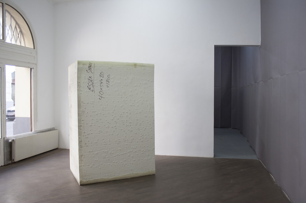
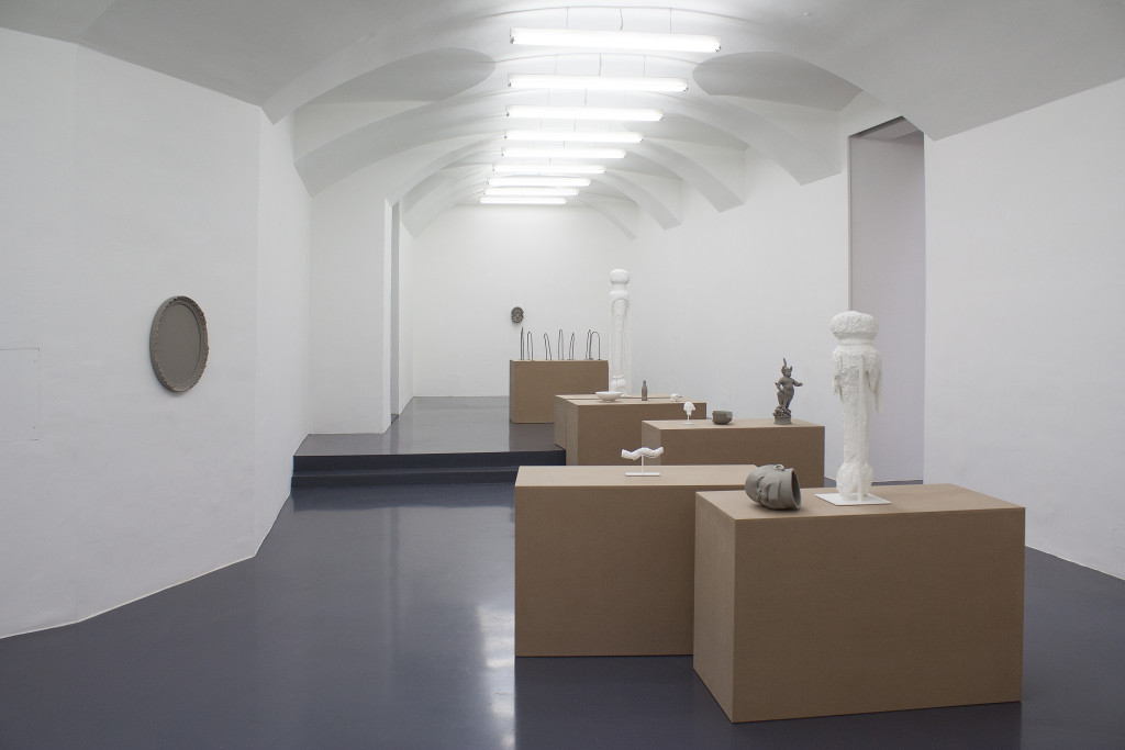
EB-T: We are recording this talk sitting in your current show at Emanuel Layr, where you are bringing objects together on pedestals. All the works are titled Support, if I understand correctly?
GG: Yes.
EB-T: At first I thought that the pedestals were the support, but now I understand that the objects are the supports and that you have moved the background out of its usual location and into the foreground by literally painting over the objects colors that are normally understood as neutral backgrounds. So it is the painted surface combined with the original object now acting as its ground that constitutes the final artwork, called Support. And the painted surface’s institutional quality continues to function as a background to everything around it even though it now has an individually separate and distinct form. Is that how it works?
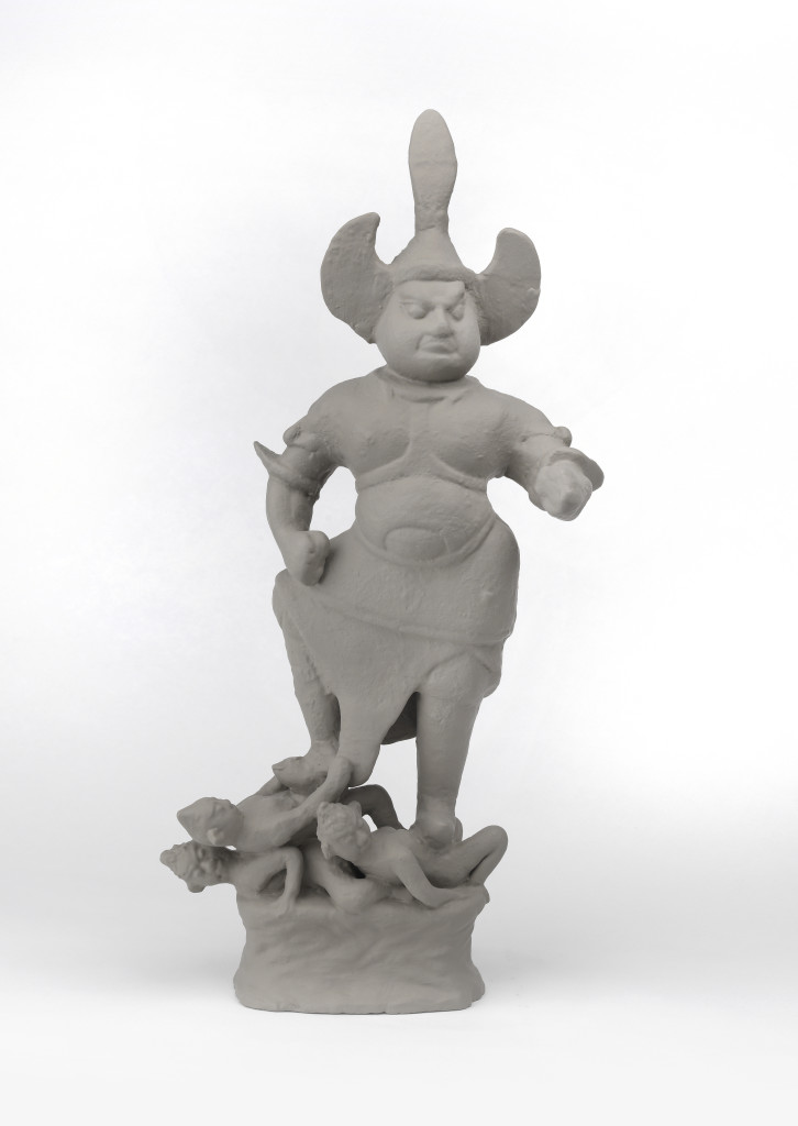
GG: Yes. The Supports are artworks or artifacts onto which a representation of the context has been displaced. The traditional relationship between context and object has been inverted. They are not dissimilar to my understanding of Piero Manzoni’s Socle du monde, or Base of the World, in which an inverted plinth presents the entire world, recognizing everything as its subject.
EB-T: But it is an actual Makonde mask? Some of the Supports look like they are casts or an inexpensive version of the original object? What are you showing us?
GG: Are you asking me if they are authentic? They are surviving relics—artifacts and artworks from the world. I understand them as readymades. I paint over them with the understanding that the image and the object are not the same thing. What I am presenting is an image, a contextual representation of a Lipico, or Makonde helmet mask. It is a framing device employed to contradict the viewer’s common assessment that the image is the object.
EB-T: Seeing these pieces now in person after having only read about them, I realize that you are using two colors—gray and white. Is it always the same gray?
GG: Yes, it has been the same gray for a very long time—thirty-five years or so.
EB-T: And which gray? Is it a special gray?
GG: It is a medium value, medium hue—a gray that is made up of various colors and intended to be somewhat fugitive in character so that it appears differently depending on its situation. Once I had started using that color there did not seem to be a good reason to change it.
EB-T: There is a sense of literalness to your work.
GG: I often intentionally confuse the literal and figurative. It is a simple mode for beginning to work through some of the dilemmas of representation, but it is a strategy that I used early and it is still visible in my work.
EB-T: Can you talk a little bit about your choice of objects? Why those objects in particular? I think you would say because you like them.
GG: I selected them initially because they addressed a distribution of attention and expression in a way that I am interested in. The objects are not from one culture, class, or time period. Some objects are or were valuable, and some are more vernacular. Most of them tend to evoke an empathy with the individuals and cultures that produced them. One of the issues that is raised in this work is the idea of aura. I do not believe that artworks have an aura, but I do think that there is a language to visual expression that often transcends culture and time period, and so when I am working on something I often feel that I will understand it and its associations better after I have worked with it, whether that has been pleasant or not.
EB-T: You are bringing together objects, some quite culturally valued and others less valued. It’s analogous to how you combine works by other artists—some of them are highly recognized and others less so. I think in that way you are also making a statement about the equivalence of many expressions.
GG: I am interested in creating a field.
EB-T: Exactly, but also showing multiplicity.
GG: I am interested in difference. I just approach it paradoxically by making everything normative.
EB-T: You could say you approach it democratically by treating everything the same. The MDF pedestals make me think of Heimo Zobernig’s work. He has done similar looking pieces that play on the notion of ambivalence, these objects may be read simultaneously as functional objects and as artworks. They oscillate between both understandings.
GG: I understand what you are saying, our concerns and interests are not unrelated. For example, I chose MDF as a material for the pedestals because it is homogenous—itis the same all the way through and used commonly around the world for counters and other supports. I also wanted something that was not gray or white, and that was not thought of as an expression per se. And this was the most practical solution. Heimo likely uses it for a similar reason.
EB-T: I would like to talk about what this really means. What is the purpose of doing it?
GG: To try to see something, to help make it visible.
EB-T: When I was preparing for this talk, assembling questions I might ask you, one night, when it was late and I was tired and being a little facetious, I wrote a question asking, “What if Donald Trump wins the election?” I put this question off, it seemed too absurd. Now, a day after the opening of your exhibition, we are faced with the incredible news. What can art do in such situations? Can it resist the more aggressive tendency towards the homogeneity of society? Can precise thinking and reflection on difference be part of an effective response?
GG: There is always a question of how we value difference. I do not think any social movement is secure. One of the things I think this work does well is that it acknowledges difference and value but locates them extrinsically, which makes each of us responsible for their definition on an ongoing basis. In that way this exhibition is a part of a tradition that attempts to perceive a world in flux, as it is.
EB-T: And give it beauty, a term that is being talked about again?
GG: Beauty is relative. It is possible to see the world as only a positive void, suggesting that if you develop a desire for beauty you also begin to refuse what is not considered beautiful, and so limit experience. It is an idea related to indeterminacy. The composer John Cage described it as letting things be themselves.
EB-T: You once did a work over wall drawings by Sol LeWitt.
GG: This was at the Rhona Hoffman Gallery in Chicago, in 2010. It was soon after Sol died, and Rhona did a large exhibition of Wall Drawing #530s-tilted forms (A, C, F, G, I, K, M, N). I understood that after the exhibition LeWitt’s wall drawing would be painted over and that other artists’ expressions would then be installed on top of them. This layering of expressions is close to my heart. An early exhibition strategy of mine was that I added only a painted monochromatic Backdrop to an exhibition situation. It allowed me to insert my work into the flow of activities in a way that both looked towards the gallery’s exhibition history as well as all the subsequent exhibitions that would follow my intervention. In this instance, I painted a white monochromatic Backdrop directly over LeWitt’s wall drawings, covering them completely. My painted Backdrop then became the background for Kehinde Wiley’s work, which was the next exhibition in the gallery. Positioning my work so that it was seen as in between things proved really effective in terms of having the ground considered as an expressive element in and of itself. Seeing these two disparate artistic expressions joined was valuable for me.
EB-T: I remember when Sol LeWitt did a big wall drawing on all four sides of the Vienna Secession’s main exhibition space and there was a discussion afterwards. One of the issues was what does it mean when after such a show the work is destroyed. A young artist who had been on the team that had realized the installation with LeWitt stood up and reported that LeWitt had said, “The work is not destroyed, the work vanishes.” I thought this was very, very poetic, and a wonderful way of seeing it. So when you painted over a LeWitt, did you think you were destroying it, or did you make it vanish? This idea of strata can also be read metaphorically—that things build up over time.
GG: Well, it also implies becoming aware of the entire history of the situation and everyone involved before and after. I would like to say that I did the exhibition because I thought it was a good idea. The circumstances were favorable and effective for what I wanted to address. And pragmatically I was in a position to do it. Rhona and I have known each other for years, we have always been on good terms, and this exhibition also fit with the spirit of the gallery.
EB-T: Are you painting such things personally?
GG: I have painted enough walls in my lifetime. I did not feel the need to personally do it. I was there and I kept Ben Gill and Ben Foch company as they painted over it.
EB-T: In thinking about strata and history, I wonder if, were one to find, in the process of restoration, the old painting underneath…could a restorer come back to it?
GG: To a white wall?
EB-T: No, to the Sol LeWitt.
GG: I do not think Sol LeWitt would consider it an artwork, at least not by him.
EB-T: Franz West once did a piece where he also “used” a LeWitt that happened to be in the room in which he was invited to exhibit. He responded to it by creating an installation that included this wall drawing. You once realized a Support in a private collection, in a private house, and, if I understand correctly, the owners of the house were allowed to install on the Backdrop whatever they wanted. Do I understand this correctly?
GG: I am going to answer more generally. The Backdrop is a ground and I prefer that other artworks and activities rotate on top and in front of it. Peter Friese, then senior curator at the Neues Museum Weserburg Bremen, kept a paper Backdrop in situ for five years after its exhibition in 2000. He rotated the subsequent exhibitions in the museum on top of it until the Backdrop became so ragged with use that the director suggested it be removed. That was an interesting cycle for the work, which, of course, may be re-made later.
EB-T: And you liked this idea?
GG: I thought it was brilliant. I had arrived at the same conclusion that Peter had arrived at independently. He took it upon himself to flesh out the possibility. I only learned about it later, and I appreciated that he understood the work and took authorship for it.
EB-T: Could you say that with your Backdrops you are creating anambience, creating an atmosphere that also brings about a certain feeling in a room? Franz West used the German term Befindlichkeit, which is difficult to translate. I don’t know how to translate it—perhaps “a state of experience of being.” Franz West was always talking about these Italian restaurants with walls full of all sorts of artworks, often kitsch and put together at random, but creating an atmosphere to bring about a certain Befindlichkeit.
GG: I am interested in the ambient, but my work is more akin to visual semiotics. There is a feeling, but it is most often revealed in another way.
EB-T: We have not touched upon the issue of institutional critique and all that, which is so important to your work. But I deliberately cut it out because all the other conversations with you and many of the texts deal with this. I thought that in this talk I would go in another direction. That said, at least brief mention should be made of artists like Daniel Buren, Michael Asher, and Marcel Broodthaers, who are very much involved in this question and whose work has relevance to yours.
GG: But also Adrian Piper, Andrea Fraser, Jimmie Durham…
EB-T: Exactly. This is a very dense topic, and as I said, it has been explored elsewhere. So I have deliberately directed the conversation toward other issues tonight. One thing I still want to ask about is that you once worked with a fifteenth-century collection.
GG: With a collection of fifteenth-century Swiss primitive painting at the Musée des Beaux-Arts, Dijon, in 2005. It was an exceptional experience to have the museum deinstall an entire room of these early paintings, wrap the room with a gray paper Backdrop, and reinstall the artworks exactly where they had originally been. The effect on viewing the work was palpable.
EB-T: Yes, exactly. Can I ask what are your favored conditions or modes of display for your Supports?
GG: Once they leave their exhibition, I prefer that they are integrated into living situations, that they use a part of the world like the floor, a tabletop, or a shelf as their support, but it is also possible to use a MDF pedestal. With my work it is often best to treat it with both sensitivity and a little indifference.
I have come to understand that the Supports are often more effective in pairs or groups, and that often a number of them together helps clarify their position. It is not true, of course, all of the time, but as a general rule it is accurate.
I tend not to make work for specific exhibitions. There are always multiple pieces in the studio. When I begin to assemble an exhibition, I start with one piece and then look for something that moves away from it, and I go from there. I have increasingly ended up with more pieces rather than less in a given situation, but the sum of the parts rarely has an overarching narrative.
I worked with Kerstin Brätsch on her show at the Arts Club of Chicago last year, and we edited the exhibition together. In the process, we were often faced with the dilemma of how to make a certain area of the exhibition work. My inclination was always to take something out, and Kerstin’s inclination was always to put something in. She was often right. There was a time during the development of the exhibition for Galerie Emanuel Layr when my scheme for this exhibition was effective, but because of my time with Kerstin I ended up adding additional Supports. It is one of the many instances where somebody I worked with expanded the way that I understand my practice.
EB-T: That is interesting. There is an age difference between the two of you—she is from another generation.
GG: Yes, she is twenty-five years younger than me.
EB-T: You are working with a lot of younger artists, and you are working with very established artists like Sol LeWitt. This is a wide spectrum.
GG: I would say that is by design, but I do not especially think of it in those terms. I work with artists, and if you treat artists with respect, most often they rise to the occasion. What they do is almost always exceptional.
EB-T: Let me finish by asking you about whether the pieces in the present show at Emanuel Layr are individual or arrangements? Do I purchase the pedestal with them?
GG: Supports are like Backdrops. It is advantageous if their display shifts and they often benefit from being seen in tandem, but they are discrete objects.
EB-T: “Discrete” is an interesting term. You will have to explain—I would like to know how they are discrete.
GG: It is a paradoxical surface. A Support is discrete in the way a mirror is discrete. It is mobile, but it is a surface that forms its image by reflection and that provides a faithful representation of something else.
EB-T: “Paradox” is a wonderful term that we had not come to yet. Is it an important issue for you?
GG: I think it is in my work from the beginning. It is a useful understanding that has allowed me to exploit a normative posture to address an understanding of “discrete” in a way that uses the mirror as a metaphor. Implying that the real or imaginary reflected image offers critical insight into the context and our thinking. It also emphasizes the role of pictures and metaphors in determining our philosophical convictions.
EB-T: We could finish by saying that your work is about difference and paradox, and about recognizing that the world is continuously revealing these aspects of itself.
GG: Yes. I think it is about trying to see, to perceive clearly.
EB-T: “Perceiving” is a wonderful word. It combines the intellectual and the perceptual—a kind of reflection with the eyes.
Published with generous assistance by the artist and permissions by the Artist Lecture Series Vienna Conversations.